Defining identity is a notoriously difficult endeavor. Identity, in the technology industry, is the name of a business vertical that developers and software vendors use to describe a class of products and services they employ for managing users, authentication, and access control. But the average person doesn’t define identity in this way. They’re more likely to describe identity as how a person or thing defines itself and is known to the world around it. I have always thought it ironic that an industry vertical named ‘Identity’ rarely produces solutions that extend beyond a narrow sliver of what identity truly is. In this post, I will present a conceptual model for identity that defines it as an expansive, organic system, and my stretch goal is that it changes how you perceive your interactions in the world (at least a little).
Identity as a Cosmological Analog
According to Dark Matter & Energy theory, the atoms, particles, and energy people commonly believe are the sum total of the universe, is known as Baryonic matter. Interestingly, and in contrast with human perception, the theory postulates that this form of matter only makes up ~5% of total matter and energy in the universe. The vast majority of the universe is said to be composed of another form of matter and energy, Dark Matter and Dark Energy. I find it fascinating there can be so much beyond our perception that goes into producing the relatively tiny sliver of what we recognize as our world.
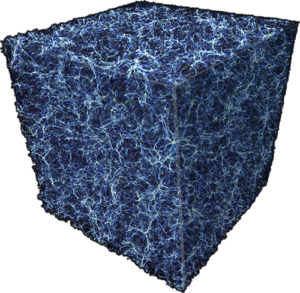
A visualization of Dark Matter – NASA, ESA, and E. Hallman (University of Colorado, Boulder)
I posit to you that your perception of the countless interactions and exchanges you participate in on a daily basis is the Baryonic equivalent of their true scope and depth – just 5% of what’s really happening. The 95% you don’t see – the organic, interconnected web that permeates everything you experience – is identity. In this way, identity can be described as the Dark Matter & Energy of our physical and digital lives.