Page 2 of 3

The Oft-Overlooked Overflow and Underflow Events

A Primer on Overflow and Underflow

To level-set, I’ll define and describe what overflow and underflow are in the context of the web. Overflow is a rather simple concept you’re probably familiar with: when an element’s content takes up more space than it allows, given style or box model constraints, it causes a scrollbar to appear or the content to be cut off from view (if you set overflow: hidden;). Underflow is the less common case you probably don’t think about: an element currently in an overflown state leaves that state as a result of the element growing in size or a reduction of the amount of content within it – visually, the scrollbars disappear and all content is visible within the element. As it turns out, Firefox and WebKit browsers offer events that alert you of changes between these two flow states.

What if I told you

Continue reading

FlightDeck and MetaLab: Bad Messaging Leads to Bad Times

NOTE: I spoke with Andrew Wilkinson (CEO of MetaLab) prior to releasing this post.

The Back Story

I arrived at Mozilla 4 years ago at age of 26 with a passion for the web. Like many Mozillians, my previous job was with a private company. Mozilla was radically different than any work environment I had ever been in. Not only is Mozilla open source, it’s also open meeting, open planning, open specs, open mockups, open bug lists – yeah, lots of open. I wasn’t used to this, not that I shied away from openness or wanted to be secretive, it simply took a while to acclimate myself.

One of the first projects I was tasked with when I arrived was Add-on Builder. It was to be a lightweight code environment for Firefox add-ons – mostly for beginners and people who wanted to test their add-ons in a collaborative way (think jsFiddle for Firefox Add-ons). Unfortunately, it was also the source of the most frustrating, painful event of my professional career. Given Add-on Builder was end-of-life’d a few months ago to free up resources for other developer-facing products, I thought I’d finally write about the event and what actually happened. As it turns out, it was far less interesting than the woefully inaccurate fable it mutated into. Here goes:

Continue reading

MVCR – Minimum Viable CSS Ribbon

I thought I’d jot down a snippet of CSS I came up with recently that I use to generate UI ribbons. The code uses :before/:after pseudo elements, which means it works in IE8+ and all the other not-shitty browsers. To ensure the content of the ribbon can be modified dynamically using JavaScript, I’ve set the pseudo element’s content property with the value attr(ribbon). The attr() content function grabs the parent element’s ribbon HTML attribute string (example: ribbon="SomeText") and uses it for the ribbon’s content. I’m pretty sure this is one of, if not the, shortest bit of code required to create CSS ribbons, but perhaps you all can improve upon it:

.ribbon:before {
	display: block;
	content: attr(ribbon);
	background: #eee;
}
	
.ribbon:after {
	display: block;
	content: " ";
	border-left: 5px dotted transparent;
	border-top: 5px solid #ccc;
	height: 0;
	width: 0;
}

CSS Selector Listeners

The following article explores a new event mechanism that I like to call CSS Selector Listeners. Selector listeners are completely bad ass, and sufficiently indistinguishable from magic, as you will soon find out.

Rise of the Mutants

Developers recently were empowered with a new way to listen for changes in the DOM: DOM Level 4 Mutation Observers. Mutation Observers emit fairly general events that tell you basic things, like when a new element has entered the DOM, or an attribute has changed on an element or subtree you are observing.

As a result of their relatively low detail resolution, developers have created libraries to help make Mutation Observers more useful for developers. Rafael Weinstein of Google recently introduced a library called Mutation Summary, which lets you watch the DOM through the lens of a limited subset of CSS selectors using a combination of Mutation Observers and its own custom logic layer to filter and interpret mutation events. The concept of listening to selector matches is intriguing because selectors inherently require the parser to quickly assess complex DOM conditions and perform selector-related logic to check for matches. Having the ability to listen for when selector states become active would be a powerful tool indeed!

A Hidden World of Events

Mutation Summary is pretty cool, but what if I told you there was a hidden world of arcane CSS selector event magic living in your browser that offered unlimited, detailed insight into the state of the DOM? Well there is, and technically there always was, in every style sheet you’ve ever written. All we needed was the right key to access this world…well, a Keyframe, to be exact.

Piggybacking the Parser, with Keyframes

I recently posted a method for using CSS Animation Keyframes to detect node insertions via the animationstart event of a dummy keyframe animation. Now let’s take a second to realize what this hack really is at its core: the ability to listen for any selector-based matches the CSS parser makes anywhere in the DOM. The Selector Listener code I’ve developed provides two methods, addSelectorListener and removeSelectorListener. These methods are available at both document and element level, and allow you to listen for any selector match, regardless of complexity. Once the parser detects a matched selector, the event bubbles up the DOM from the matched target element to the element or document the selector listener is attached to. Here’s what it looks like in action:

// Some action to perform when a match occurs
var sequenceMatch = function(){
  alert("Selector listeners, they're easy as A, B, C!");
};

// Attaching your selector listener to the document or an element
document.addSelectorListener('.one + .two + .three', sequenceMatch);

// Remove the selector listener when it is no longer needed
document.removeSelectorListener('.one + .two + .three', sequenceMatch);

The Goods: Code & Demo

The code that provides all this new hotness, as well as more examples of what’s possible, is available on Github here: SelectorListener Code Repo

You can also play around a bit with this demo page: SelectorListener Demo

A Modal Cure in Pure CSS – No Wrappers, no JavaScript, no BS

Modals. They’ve been the subject of countless hacks over the years (I did a cross-browser one a while ago here), but due to cross-browser considerations, they usually are less than elegant in their implementation.

Well, if you don’t care about IE < 9, things are about to get much, much easier. This little trick is so simple it’s going to make you cry, in fact it’s so easy, it may cause you to audibly curse IE louder and more passionately than you ever have:


#modal {
    display: block;
    position: fixed;
    top: 50%;
    left: 50%;
    box-sizing: border-box;
    transform: translate(-50%, -50%);
}

Here’s a fiddle so you can see it in action:

Yeah I know, all those hours wasted on wrapper divs, tables, crazy CSS, and performance-robbing JS, all to get hoodwinked by some top/left positioning and a transform property, go figure.

I Want a DAMNodeInserted Event!

Have DOM Level 3 Mutation Events got you down?

There’s a long, sordid history behind DOM Level 3 Mutation Events. They’re basically the DOM Event equivalent of crack for developers: a ridiculous high of programmatic, dynamic handling of DOM manipulation, with a crash of endless, unavoidable, performance-destroying event evaluation.

John Resig detailed the plight of DOM Mutation Events in a mailing list thread, circa 2009:

Yes, DOM mutation events already exist (in Firefox and Opera – fairly reliably – and dicey in Safari). They have a huge problem, though:

They absolutely cripple DOM performance on any page which they’re enabled.

Firefox, for example, when it realizes that a mutation event has been turned on, instantly goes into an incredibly-slow code path where it has to fire events at every single DOM modification. This means that doing something like .innerHTML = “foo” where it wipes out 1000 elements would fire, at least 1000 + 1 events (1000 removal events, 1 addition event).

Mutation Events have since been deprecated, and browsers have not implemented any sort of replacement…but unknowingly, they actually have 😉

But wait! An epic hack emerges!

What I’m going to present below is a hack in the truest sense of the word, but damn, is it cool. The method I’ve devised provides the same functionality DOMNodeInserted offered, without requiring you to annihilate browser performance in the process – and it is very likely to work for a long, long time.

The Description

Basically what we’re going to do is setup a CSS keyframe sequence that targets (via your choice of CSS selector) whatever DOM elements you want to receive a DOM node insertion event for. I used a relatively benign and little used css property, clip I use outline-color in an attempt to avoid messing with intended page styles – the code once targeted the clip property, but it is no longer animatable in IE as of version 11. That said, any property that can be animated will work, choose whichever one you like.

Next I added a document-wide animationstart listener that I use as a delegate to process the node insertions. The animation event has a property called animationName on it that tells you which keyframe sequence kicked off the animation. Just make sure the animationName property is the same as the keyframe sequence name you added for node insertions and you’re good to go.

The Demo

That’s about it, pretty simple huh? Let’s see it in action – notice that the text in the divs isn’t added until their insertion into the DOM is detected:

Party time, excellent!

There you have it folks, a scope-able, performant, relatively simple method for DOM node insertion listeners in all browsers that support CSS3 Animations.

In related news: I will be accepting donations in the form of Jamba Juice gift cards, or pure gold bullion if you’re feeling especially generous.

Deep, Strict Equality Comparison of Native Types in JavaScript

The Why

My buddy and I have been working on a web app and he recently needed a way to compare and ensure that two JS native instances were of the same type and that they were strictly equal (=== vs a loose equality check, ==). After you do the basic check to ensure that the two natives are of the same type, checking strict equality is a piece of cake for some types like Number, String, and Boolean. The interesting checks come when dealing with the other types though. The code is worth a thousand posts in this case, so let’s cut to the chase:

The Code

If you are unfamiliar with things like typeOf, Array.from, and Object.extend – (THIS DOES NOT EXTEND THE PROTOTYPE OF OBJECT), that’s OK because those are little helpers provided by the awesome MooTools JS framework which I contribute to 😉

Object.extend({
  'equals': function(first, second){
    if (first !== second){
      var type = typeOf(first),
          every = Array.every;
      if (type != typeOf(second)) return false;
      switch (type){
        case 'string': case 'regexp': return String(first) == String(second);
        case 'date': return first.getTime() == second.getTime();
        case 'arguments':
          first = Array.from(first);
          second = Array.from(second);
        case 'object': every = Object.every;
        case 'array': case 'object': case 'arguments':
          if (Object.getLength(first) != Object.getLength(second)) return false;
          return every(first, function(value, i){
            return (i in second) && Object.equals(value, second[i]);
          });
      }
    }
    else return true;
  }
});

Step 1: Type checking

In this code block, I first start by type checking with MooTools’ typeOf, this helper is a bit better than the native typeof because it distinguishes between arrays, arguments objects, and DOM collections (also node lists), as well as a few other type-check oddities.

Step 2: Use the right equality check

Once I know both types are the same, we throw that into a switch to sift it into the right equality check case. You’ll notice there are very different methods employed to ascertain equality depending on the type you’re dealing with.

Step 3: Some checks are easier than others…

As stated above, numbers, strings, and booleans are all easy to check, so we knock them out in one case. Next up is Regexp, if you just compare them strait-up, two regexp objects will always report false, even if their regexp matching characters are identical. The best way there is to use toString on each to compare the actual matching characters. Next is Date. I chose not to use toString to compare date objects because the output is a low resolution time that only goes to minutes. To know two dates are exactly the same, instead I use getTime(), which gives me millisecond precision. Lastly are Array and Object. These two are not too much harder, they just require iterating the array or walking the object, then using the Object.equals method recursively on the values descending to the full depth of the instance.

What about Function equality?

Due to the nature of the need, and the nearly impossible task of ensuring functional equality on unnamed and non-cached functions, this was not a concern for me and is not likely a concern for the broad range of use-cases.

Hope this helps, enjoy!

(If you see any errors or I missed a type you think should be included, let me know in the comments!)

The Best Damn Modal Method Period™

The Gist

In the long annals of web history there have been many attempts at creating modal dialog boxes. As far as I’m aware, all methods to date use hard-coded element heights and heavy-handed JavaScript logic to center the modal in the viewport (not to mention the complex measurement of elements and resetting of styles they do on window resize). There are a number of ways to vertically center things with HTML and CSS, Douglas Heriot details most of them in the following post: Vertical Centering with CSS via ThemeForest’s Lost In the Woods blog.

Thinking Outside the Box…Literally

The other day, I threw an off-the-shelf lightbox script into a new project that I had used previously. Quickly, old frustrations returned as I looked over the mess of code and calculations required to do something as simple as positioning an element in the center of a page. I thought “Holy expletive outburst Batman, there has to be a better way than this!”. Turns out there was.

I’ve devised a method for centering modal content that is radically easier than any that have come before it. There are two types of modals you can create with this method that I’ll be discussing in this post. The first is a basic single element modal. The second is a modal with a header, footer, and even more dynamic height functionality. Both varieties automatically resize and recenter the modal in response to changes in size or content. The two methods work in IE7+, Firefox 2+, Chrome, and Safari 3+ (IE6 support requires fixed position fakery, but that is par for the course).

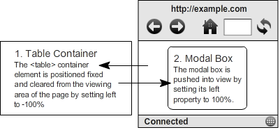
Here is a diagram so you can visualize the basic HTML and CSS that forms the foundational for both variations of the method:

A Simple Modal

Start with the following simple HTML structure:


"Nooo, a table!", I can hear it now, sigh. You want a simple, non-JS, vertically centered modal or not buddy? Yeah, that's what I thought. Here's a preview of what you're about to think in 10 seconds: "Just when I was about to light this guy up for simply nesting crap in a table (big wup), he throws down this sweet CSS and totally redeems himself!". Here's why you're about to think that:

(I have commented next to the property values that can be optionally user-specified using any CSS unit you'd like)

html, body
{
    height: 100%; /* root and body MUST be height 100% */
}

#modal
{
    position: fixed;
    top: 0;
    left: -100%;
    height: 100%;
    width: 100%;
}

#modal-tbody, #modal-tr, #modal-td
{
    height: 100%; /* All table elements should be height 100% */
}

#modal-td
{
    vertical-align: middle;
}

#modal-content
{
    position: relative;
    left: 100%;
    height: auto; /* HEIGHT optional, any unit */
    width: 50%; /* WIDTH optional, any unit */    
    max-height: 80%; /* MAX-HEIGHT optional, if height auto, must be % */
    min-height: 80px; /* MIN-HEIGHT optional, any unit */
    max-width: 225px; /* MAX-WIDTH optional, any unit */
    min-width: 80px; /* MIN-WIDTH optional, any unit */
    margin: 0 auto;
    border: 1px solid;
    background: #eaeaea;
    overflow: auto;
}

Here's a basic example via jsFiddle:

NOTE: When using the simple modal method with height set to auto, you must constrain the modal to a percentage-based max-width in order to ensure that scroll bars appear when the modal content is taller than the window. An example of this use-case would be cases where you need to add elements to the modal, but outside the modal-body element, such as a header and footer. Luckily the advanced method described below allows for this.

The Advanced, Have-your-cake-and-eat-it-too Modal

There are cases were you want the best of everything. For such cases, you'll need a slightly modified HTML structure:


There is also a single addition to the CSS:

#modal-content
{
	overflow: auto;
}

Notice I have wrapped the body in another element, modal-content. This is the only required change, the header and footer are just so our advanced modal demo looks more like the intricate modals you see on the web today.

Next, you need to set a single style with JavaScript on window resize. Now don't get all sad face on me, this one-line of JavaScript is nothing like the complex, performance assaulting JS found in the modal scripts floating around the net. This is about as close to set-it-and-forget-it you'll ever get, let's take a look:

window.addEventListener('resize', function(){
    document.getElementById('modal-content').style.maxHeight = document.documentElement.offsetHeight - headerFooterMargin;
}, false);

Above you'll notice the header/footer/margin variable. In cases where you have a header, footer, or want to allow extra space between the modal and the edge of the window on resize, you'll need to subtract that value from the document's height offset.

The awesome thing about this JavaScript is that it retains 100% of the adaptive ability of the modal. All other modal scripts on the web fall down when you add dynamic content or manipulate the size of their modal elements. Usually if you add content afterward, modal scripts require you to fire some laborious recalculation method that resets a massive set of height, width, and positioning values in order to maintain a centered and scrollable modal. The Best Damn Modal Method Period eliminates all that unneeded calculation and frees you up to create the most dynamic and complex modal interactions you can think of.

Here's a full-page demo of the advanced method in action. For my own purposes, I create a MooTools class using the Best Damn Modal Method Period for my own convenience, but the output remains the same:

Sexy Full-size Advanced Modal Demo

Happy modal'n folks!

10 years later, the sadness remains

I always have a hard time around 9/11 each year.

Every year I watch the videos again and cry just like I did that day sitting in my school’s student union. Of the 3,000 innocent people who were killed, I didn’t know one, but I would have liked to. 19 psychopaths with airplanes took away from all of us the ability to ever know them. They extinguished the hopes, dreams, and aspirations of 3,000 in an instant. They stole 3,000 fathers, mothers, sons, daughters, and spouses from families that loved them. They murdered 3,000 of our fellow Americans.

Please take the time each day to appreciate, cherish, and love whoever walks through the door with a smile to greet you. Perhaps it’s your father, mother, son, daughter, or spouse, maybe it’s your roommate or friend. Remember that for 3,000 families, never again will they see that person walk through their door to say hello or I love you.

Sit in quiet reflection and think about how you felt that day in September, write the names of those 3,000 on your heart, and most importantly, never forget.

MooTools Vertical Text Element Method

Vertical text is one of those things that you need occasionally in designing web sites and apps. Sadly, such a seemingly simple tweak on presentation is not easily accomplished. Vertical text can however be achieved with a simple mixture of CSS and subtle manipulation of the text content in elements. For added convenience, I wrapped up this method as a MooTools Element extension, let’s check out how it’s done:

Element.implement('vertical', function(){
    return this.setStyles({
        'float': 'left',
        'text-align': 'center',
        'line-height': '100%',
        'white-space': 'pre-line'
    }).set('text', this.get('text').split('').join('\n'));  
});

As you can see, the CSS is rather simple, and the modification to the elements text content is quite benign (extreme corner cases aside). In case the output is hard to visualize, here is a jsFiddle example so you can see it in action:

© 2024 Back Alley Coder

Theme by Anders NorenUp ↑